
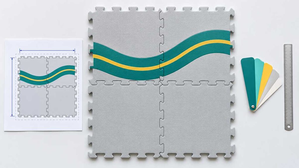
Which edge did the designer measure from? On an interlocking foam mat, a logo placed 30 mm from a tooth tip won’t sit in the same spot as one placed 30 mm from the assembled seam. Both samples could match the instruction “30 mm from the edge.” Neither the artwork file nor a larger logo preview resolves the ambiguity.
For a custom foam mat, send the file to print, a dimensioned placement drawing and a dated proof that names the revision to sample. The print file carries the image; the drawing tells the printer where it belongs; the proof shows the buyer what that combination should look like. For a puzzle set, show the assembled design as well as the individual tiles.
Use the supplier’s current production outline for the SKU. A clean sketch is fine for discussing placement, but it is not a cutting file.
Start with the finished mat, not the artboard
Ask for the outline for the exact SKU, size and tooling revision. Mark the units, printed face, top edge and viewing direction. If the reverse also carries artwork, show it in a separate view labeled “back, viewed from the back.” Don’t mirror the buyer’s file for a transfer process unless the printer asks; two people can easily reverse the same image twice.
Give each critical graphic a finished width and height and locate an identifiable point on it. For example: “Logo bounding box 80 × 24 mm; upper-left corner 30 mm right and 40 mm down from the upper-left corner of the assembled layout, front view, borders excluded.” Those are example design choices, not recommended margins. A centered logo needs a reference too: centered on the full mat, on one panel or within a printable area?
Keep the buyer’s master at finished size, even if the printer returns a file that measures slightly differently. In roll-to-roll printing on PET film, researchers adjusted the design separately along and across the moving web to account for deformation. That was a printed circuit, not a mat specification. If your film printer needs a similar adjustment, have them label the compensated production file and retain your original. Measure the sample against the approved finished dimensions; don’t apply the printer’s correction a second time.
For interlocking pieces, distinguish the loose tile outline, including teeth, from the installed repeat, the distance from a point on one tile to the corresponding point on the next. Dimension removable borders separately. If those details aren’t settled, resolve the puzzle mat construction and border options before dividing the artwork into tiles.
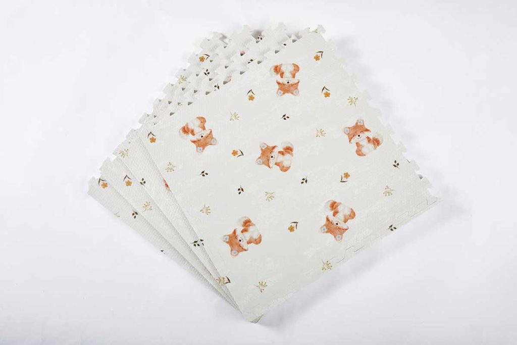
Mark what prints, what gets cut and what must stay clear
| Mark on the placement drawing | What the printer and buyer need to agree |
|---|---|
| Finished outline or cut path | Which supplier drawing controls the final edge? Keep this line off the printed face. |
| Printable area | Where can this process actually deposit or transfer the design on this construction? It may not reach the cut edge. |
| Bleed, if required | How far should background artwork extend beyond the cut? Use the printer’s allowance and direction, not a generic paper-print setting. |
| Safe and no-print areas | Where must text and logos stay inside, and which areas must remain free of ink altogether? Mark teeth, fold channels, handles or recesses where relevant. |
| Placement tolerance | From which feature will an offset be measured, in which direction, and what variation will the buyer accept? Record the agreed value before sample approval. |
Keep guides on a named, nonprinting reference layer or separate proof, as the printer requests. Turning a cut path red doesn’t make it nonprinting. Ask for an output preview with the guides removed: the buyer should see the road, not a red line running through it.
How to check artwork across a puzzle mat seam
Consider a four-tile road design. Tiles A and B form the top row, with C and D below. Each tile adds 300 × 300 mm to the assembled layout, so the design field is 600 × 600 mm before borders. That 300 mm is the installed repeat, not the loose tile’s tooth-to-tooth dimension.
A road crosses from A into B at 100 mm below the top of the assembled field. Turn B through 180 degrees, and its road entrance moves to 200 mm below the top on the opposite side. The tile still looks plausible by itself; the road no longer joins. A photo of B alone would be a poor approval reference.
- Draw the continuous scene at assembled size. Overlay the supplier’s tile boundaries without stretching the scene to fit individual tiles.
- Give each piece an ID and an up arrow on the reference proof, not on the printed artwork. Show any border pieces that carry part of the design.
- Export the individual production files from the same master revision. Reassemble previews of the exports, not just the original master: this catches a swapped tile, wrong crop or accidental rotation.
- Assemble the printed sample in the same order and orientation. At the A/B seam, measure from the same top edge to the road centerline on each side. Record both readings with the proof revision.
Read the two measurements together. If A reads 100 mm and B reads 103 mm, the road has a 3 mm step. If both read 103 mm, the road meets at the seam but sits 3 mm below the drawing there. The first is a seam mismatch; the second is a placement error. These example readings are not pass/fail limits. Agree on both limits before approving the sample.
If customers are meant to arrange the tiles in any order, make that decision before commissioning a continuous scene. A self-contained motif on each piece can work in several orientations; a road with a single matching entrance cannot.
What file format and resolution should you send?
Ask which file the printer will actually output and which file is for viewing only. A PDF can contain vector paths, a low-resolution screenshot, or both. A filename ending in PDF tells you little about whether a logo will print cleanly.
- Logos, lettering and alignment marks: supply editable vector artwork when the process accepts it. Retain a live-text master; send an outlined production copy if requested. Proofread the outlined copy, including accents, symbols and small numerals.
- Photos and painted illustrations: check effective resolution at final print size. An image 2,400 pixels wide placed at 12 inches is 200 pixels per inch; at 24 inches it is 100. Neither is an acceptance threshold. Ask the printer for the target at the intended size and process.
- Linked assets and fonts: open the delivery copy from a different folder or workstation. A document that looks complete on the designer’s machine can be missing a linked image at the factory. Adobe’s file-packaging instructions cover collecting linked graphics and fonts. Share font files only where the license permits.
- Output settings: agree on color mode/profile, named spot colors, transparency, overprint, any white layer and the required export preset. Don’t flatten everything or generate color separations by default. Send a labeled visual proof alongside the production file so the operator can flag an unexpected result.
Look closely at the opening in a small printed “e,” or the thin white lettering inside a dark logo. Spreading ink can widen a printed stroke and narrow the unprinted gap beside it. That distinction was visible in flexographic prints made with UV cyan ink on polypropylene film. Put the smallest actual lettering on the sample and check that the openings remain legible on the proposed face. For an embossed mat, use the surface texture and print guide to decide where to inspect the relief.
Approve placement on a proof and color on the intended surface
A screen proof is useful for catching the wrong logo, front-to-back reversal or a missing border. It can’t tell you whether white lettering is opaque enough over a blue mat. Identify the base color, the layer that receives the print and any film or finish over it. Specify whether a white area means white ink or unprinted substrate; they can look identical on a white artboard.
For a clear-film laminate, ask for a second proof that shows white ink coverage only. Even a colored logo with no white lettering may need a white backing; a deliberately transparent window should not have one. In flexographic printing on film, changing the opaque white layer changes how some overprinted colors appear. For the mat, the useful check is simple: view the printed film on the intended base color and approve that combination, not the logo on a white screen.
For a brand-critical color, name the reference and its edition or physical master. Agree on lighting and the comparison sample. Ask for the actual combination of face, ink and finish for approval; label any substitute proof with what it cannot establish. A photograph can document a seam error, but it shouldn’t silently replace the agreed physical color reference.
Release one revision for one purpose
If tile B is upside down in R01, don’t reply “approved except for B.” Mark R01 superseded and ask for R02: corrected tile file, assembled proof and revision record. A useful reply is “R02 approved for one assembled sample. Color approval pending. No bulk release.” Someone reading the order a month later can tell exactly what was authorized.
For production release, record the SKU and colorway, artwork and tooling revisions, proof ID, physical sample ID, outstanding exceptions, authorized approver and date. Identify what the release covers. A later change to scale, ink, print face or tile order needs a documented review; don’t overwrite the released files. Use the foam mat sample approval checklist for the rest of the mat. Carton marks, inserts and sleeve graphics belong in the retail packaging specification, not on the mat’s print layer.
When requesting a custom mat review, send the proof and the matching print files together. End with the decision you need: “Please confirm the printable area on this face and the road position at the A/B seam before making the R02 sample.” That gives the supplier something specific to check before ink reaches the mat. ” Seam before sampling R02” gives the supplier a much clearer job than “please check artwork.”